What makes a good app? Sure, it should do what it claims to do, intuitively and efficiently. But that is just the base line. How do you stand out from the sea of apps? You need to go above and beyond, and whimsy may just be the secret ingredient you need.
Tumblr
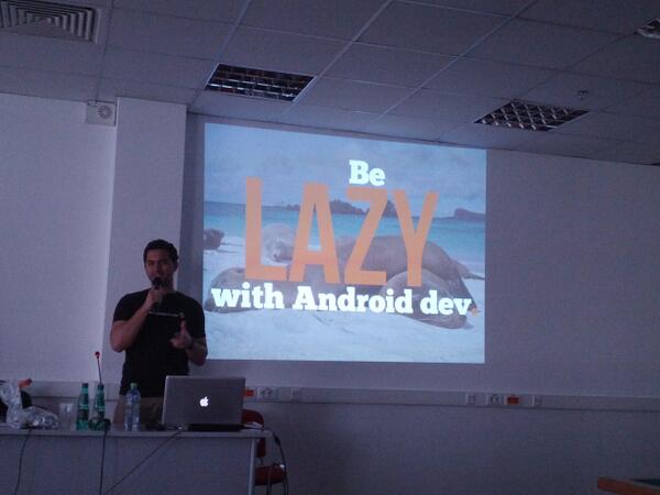
At the keynote at AnDevCon Boston, Chris Haseman and Zack Sultan showed us how they designed and implemented the Tumblr app. They shared many tips and tricks to make your app look good and work well, but the recurring theme is to delight your user.
There are many whimsical touches to Tumblr, one being the pull-to-refresh animation:
Tumblr could have gone with a loading text or a standard spinny, but this custom animation brings the app a notch above others. It entices users to refresh more, increasing engagement. This is the power of whimsy.
Welcome animations
Animation is a great way to add whimsy to your app. At AltWWDC, Ben Johnson showcased many different apps with effective animations.
This is the welcome page of the Just Landed app. The subtle movement of the plane and the clouds hints to the users that there is more to come, encouraging them to try it out. You can argue that this is gratuitous, nothing more than eye candy. It adds no functionality to the app. But apps are not just about functionality. You need to connect with your users, make them feel good using your app. A delightful welcome page sets the stage for the rest of the app, and helps them stay engaged.
Reward your users
What’s happening here? You’re in the Zappos app, thought these sneakers look good, and pressed the "add to cart" button. A cat floated out, dropping the shoes into your cart Mary-Poppins style. What’s your reaction? Cool, I want to see that again. How? By adding more stuff to your cart! A whimsical gesture that directly increases the bottom line. I doubt anyone can call that gratuitous.
Whimsy everywhere
So you want to be whimsical. What to do? Whimsy hinges on unexpectedness, so it's a bit of an oxymoron to provide a formula. Fortunately, you have already taken the first step - awareness. Once you start paying attention, you will see whimsy everywhere, adding them to your repertoire, ready to inspire your own.
The other day I found whimsy in the most boring place of all - airplane safety video.
The video caught my eyes with a teeny tiny suitcase that got stowed under the seat. I found myself looking forward to more funny shots, and paying attention throughout. If you graph the whimsical moments, you can see that they frontload them to set the tone:
Once you are hooked, they get down to business and show you some serious content. Just before you get bored, they sprinkle a bit of whimsy again, keeping you on your toes, watching the whole video looking for more.
Unpredictable delights
It was said that we are addicted to emails because they are like slot machines. Most of the time you get nothing, but once in a while you get something awesome, and so you keep playing, in hope of hitting jackpot. Whimsy does the same trick to your app. It delights users in unpredictable ways, keeping them engaged, and separates your app from the herd.


